Hello everyone and welcome back to my blog. Today I am bringing to you another pocket page spread! This one is strictly pictures and with minimal, but strategic embellishing. I had a lot of photos of our view at the top and wanted to make a stunning spread featuring them all. There are some photos with more white space than others and I give you some examples on how to use it!

This page has a title that extends across four pockets. Since the white space was consistent across the top edge, I treated it as if it was a full piece of cardstock that was 12" long. I simple found an alphabet that worked for this space and spaced them out accordingly. I think the minimal look represents the skyline well too.

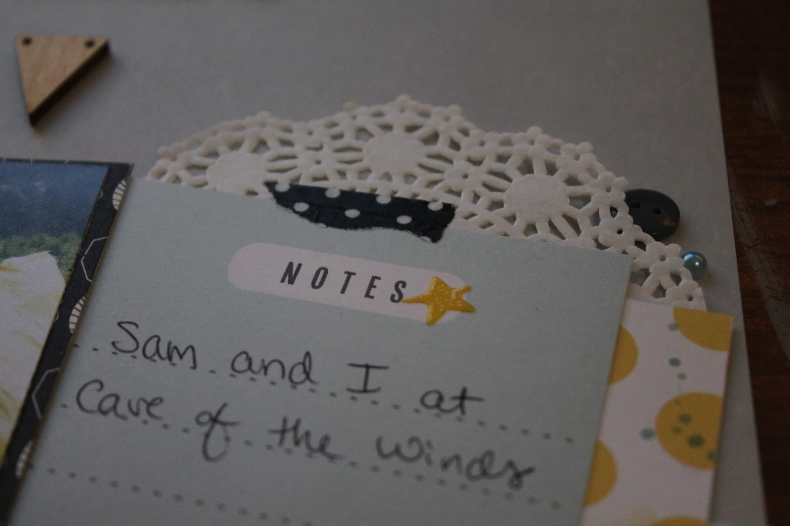
I had one photo that wasn't like the others. Since it was a little different, it needed something different for it's cluster. I decided to do something less structured and more free form. I used circular and ripped elements. I layered two pieces of washi tape (one from Target and one from Michael's). Then, I added an Elle's Studio diecut with two tiny staples. Lastly, I used an Amy Tangerine puffy sticker and some Fancy Pants puffy dots to complete this page.

All photo layouts don't have to be overwhelming. Being strategic with photo placement can really help the flow of a layout. Sometimes similar photos can help make a page. I hope you enjoyed this double page spread! Thanks for stopping by!
- October 10, 2017
- 0 Comments