VIDEO: Color Theories - Green // 12x12 Layout Process
June 10, 2017
Hello everyone! Welcome back! Today we're back with another episode of Color Theories! If you've been following along you would know that we already made it to the green lesson. If you've missed a couple of our colorful lessons check out our playlist! Don't forget to watch Ariana's video after mine! I'll be honest right in the beginning of this post, I had a very difficult time making this green layout. I even picked something that went so well with the green theme! Don't be afraid to go out of your comfort zone and try a rare color in your palate.
I decided that perhaps picking something that obviously went with this green challenge would make it easier, it did not. I felt that the green background was hard to match to the green on the Playbill and I didn't want them to clash. I really need to evaluate the greenness of my stash! Below is the process video and I hope you enjoy!
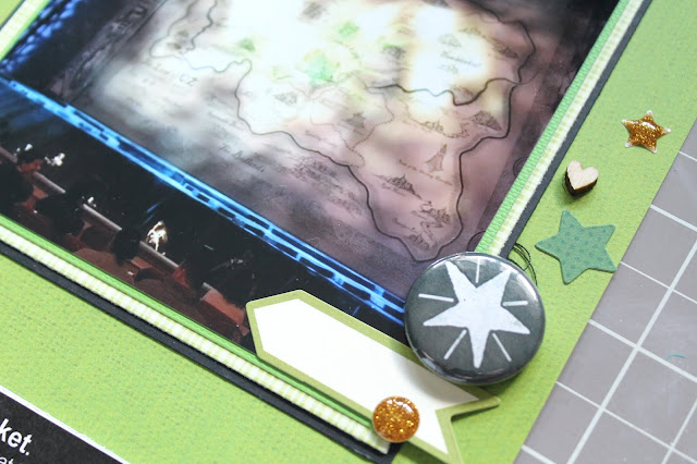
So, after realizing that this was going to be very hard, I decided to keep it simple. A lightly textured background to add a little interest without causing distraction ended up working the best. This paper is from the DCWV Spring Stack. I layered a couple of papers behind my main photo from various places. One is from a baby paper stack, the other is plain cardstock.
I think that keeping things simple on this page was the right way to go. There were a lot of different sized items to work around which was also hard. I placed a white shipping tag on top of the pocket to make a place for my journaling to live. I decorated it with Tim Holtz stickers and Freckled Fawn enamel dots.
I created a small cluster to the right of my photo using various stash bits. The flair piece is from Jenni Bowlin, the star sticker is from Jillibean Soup as well as the tab sticker. I used a wood veneer heart and thread for texture.


0 comments
Thanks for leaving a comment! I appreciate all feedback, suggestions, questions, and comments! Don't forget that you can find me on Instagram and Facebook to get more immediate feedback!
______________________________________
Compliance with the new European Union E-Privacy Regulation:
If you leave a comment on this blog, you do so with the knowledge that your name and blog link are visible to all who visit this blog, that you have published your own personal details and that you have consented for your personal information to be displayed.
This blog is currently made in the USA.