VIDEO: Paper Pads: 6x6 Fix! // Hooray - Clover Technique
April 08, 2017
Welcome back crafty friends! It has been a while since I made a layout that I loved and today I have such a fun one to share with you! As you can tell, this is part of my 6x6 Fix series. This technique is not wildly innovative by any means, it is just a strategic placement of 6x6 papers that looks nice to the eye. However, I decided to name this technique the "clover" technique because it kind of looked one in an abstract sort of way. Let's just jump into some of the details of this layout!
Like I mentioned before, you will want three 6x6 pieces of paper. They could all be from the same collection, different collections (like I did here), or even all the same pattern, but in different orientations. Either way this is a really easy technique to use on all types of layouts! Below is my process video where I'll explain why I did certain things and such. I hope you enjoy!
Now that you know the process behind the layout, I can dive into more up close photos and details! The three papers I used to create my clover are from Pebbles' Garden Party (left), Crate Paper's Notes & Things (top), and My Mind's Eye Here is Happy paper pad (right). To give each paper more dimension I recommend either inking them or do what I did and make a marker border. In the process video you can see how I used my t-square ruler to make the lines all of the pieces.
I did simple matting on my photo here with some white cardstock and then DCWV jeweled cardstock behind that. I also made a small cluster to the left of the photo. Starting with a base using a Project Life card that I received in a RAK. I also included a doily (which is actually Halloween themed), a heart sticker and a phrase sticker. This part and the photo are on foam to give it more emphasis.
The title is one of my favorite things about this layout (although I do love the entire thing)! The title starts in the top right with this Amy Tangerine thicker that says "hooray". The script font adds whimsy while the black color adds a lot of contrast. I also added some sequins to give an additional pop of color.
I really wanted to accent this portion of the title. So, I included this chipboard polka dot arrow. Arrows are a great way to add emphasis without a lot of effort. In this photo you can also see the lines on the papers a little bit better. They add a lot to the page even though it is something so small.
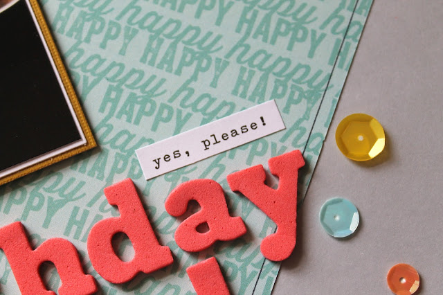
The rest of the title is to the bottom right of the photo. This helps create a diagonal path for the eye to follow. Having the sequins on both sections of the title as well as the phrase stickers also helps keep the cohesiveness. This half of the title is made again with some American Crafts Thickers that are so lovely! The coral color matched my top patterned paper very well.
I hope you all enjoyed this really fun layout! I don't scrapbook birthday layouts that often (or do I?). Let me know what some of your birthday traditions are! We don't usually do pie, but there is always a treat! Again, I hope you enjoyed this video for my 6x6 Fix series and if you want to see more ideas go check out my playlist over on YouTube! Thanks for stopping by!


0 comments
Thanks for leaving a comment! I appreciate all feedback, suggestions, questions, and comments! Don't forget that you can find me on Instagram and Facebook to get more immediate feedback!
______________________________________
Compliance with the new European Union E-Privacy Regulation:
If you leave a comment on this blog, you do so with the knowledge that your name and blog link are visible to all who visit this blog, that you have published your own personal details and that you have consented for your personal information to be displayed.
This blog is currently made in the USA.