VIDEO: Challenge Your Stash YT Hop! // Tic Tac Toe Challenge
April 16, 2017
Hi crafty friends! Today, I have a very fun treat for you! It's the time of the month where I participate in another Challenge Your Stash YT Hop! This month's challenge was to use a Tic-Tac-Toe board and use three items. I know that I don't share double paged layouts very often, but I am absolutely starting to become addicted to them! I like the little bit of a challenge in making two pages cohesive and flow well. Let us dive right into it!
When thinking about making a double page spread, I first start with a basic background. This one happens to be white cardstock for both sides, but you could also use colored cardstock or even patterned paper. I find that having the same background paper for both sides helps me greatly. I hope you enjoy the process video for this fun tic-tac-toe challenge! Be sure to check out everyone else's videos as well.
So, as you can tell, for my tic-tac-toe I decided to use flair, wood veneer, and washi tape. You can see the full tic-tac-toe board in my video in case you want to play along! Now, before we really dive in, this is a warning that there are a LOT of photos coming at you. I will keep the in between text short so you can get all of the details that you need.
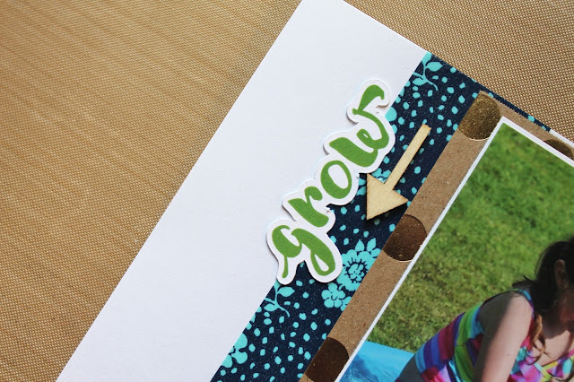
We're starting in the top left corner and looking at some details! I have used a Pretty Little Studio die cut word to bring out the green in the photos. As per the tic-tac-tie board, I also placed an arrow wood veneer. Whenever I put arrows on a layout, I want to be sure that they aren't pointing off of the page and that they are pointing to something I want the viewer to go to. In this case, it points to my little elephant!
This next cluster is so cute! I've been meaning to use this little elephant stamp. I picked him up at Michael's the other week for .50. I stamped him and then lightly colored him using some of my watercolor pencils. As you can see, he is atop of the navy and floral washi tape. The elephant is also on top of a Doodlebug doily in the color poolside. I like to keep my clusters simple, but intense with texture. I also paired another Pretty Little Studio diecut heart, a tiny wood veneer heart, and some sequins. All of these items have a different height, size, color, and texture which is a field day for my eyeballs.
This cluster I consider to be the bridge between my pages. It uses a Project Life card that I received in a RAK. I like how the bright yellow pops on the page. On top of that, I layered a white tag with some twine, a Heidi Swapp chipboard glitter circle, a Project Life Kiwi Edition flair, and an asterisk wood veneer. Again, I love working with texture. Here you can see the main texture comes from the glitter piece.
Hopping over to the other page of the full layout, I have two photos. This side I would consider to be a little bit more basic over the other side, but I still love it and think it flows well. I used more of the beautiful gold foiled polka dot paper. This helps bring more cohesiveness and flow.
Surprisingly, the title was the very last thing I added to this layout. I used a Pebbles diecut that says splash to give a base for my title. I then incorporated some lime colored Thickers by American Crafts. I love the size of these Thickers, but not a huge fan of the color, but this was a perfect layout to use them on.
The last cluster I created is in the bottom right of the second layout. I used some more of the Pretty Little Studio diecuts from their Woodland collection. I also used a little sticker from Simple Stories. I had to add a little more splash of summer elements, so I found this diecut in the same Pebbles pack and I put it in this cluster. Lastly, I decorated the entire page with some colorful sequins from a RAK. I hope you all enjoyed this fun layout and be sure to hop along for the rest of the Tic Tac Toe challenge! Thanks for stopping by!


0 comments
Thanks for leaving a comment! I appreciate all feedback, suggestions, questions, and comments! Don't forget that you can find me on Instagram and Facebook to get more immediate feedback!
______________________________________
Compliance with the new European Union E-Privacy Regulation:
If you leave a comment on this blog, you do so with the knowledge that your name and blog link are visible to all who visit this blog, that you have published your own personal details and that you have consented for your personal information to be displayed.
This blog is currently made in the USA.