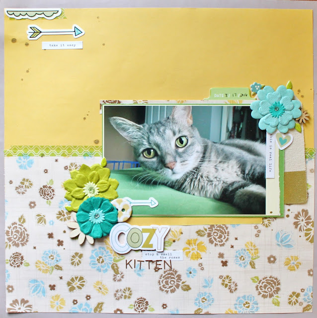
VIDEO: Pick 5! // Cozy Kitten
November 12, 2016
Hello scrappy friends! I am bringing back an oldie, but a goody for this week's video! It is time for another pick 5!! If you're new here, this pick 5 series is based off of Adele's grab 5 series on her YouTube channel. You pick 5 items from your stash and then try to use them all on one layout. It's a simple and fun challenge that I like to give myself.
This is a layout that mixes fall color schemes with summer vibes. I really like the way it turned out in the end. The five items I decided on for this pick 5 are the following: 2 really old papers from Close To My Heart (no idea what collection),the die cut pack from Pretty Little Studio for the Oakley Avenue collection, Heidi Swapp Color Shine in the color Tea, a half use pack of Prima flowers, and a roll of green washi tape from Michael's.
Ta-da! I hope you enjoyed the process video, but now I can dive into some more things I wanted to mention. I hope you stick around for some great tips, product links, and close up detail shots of the layout! Let's jump right in!
The background and border of this layout are made from two pieces of Close To My Heart patterned papers. I truly adore the color scheme that these papers have! The blues, yellows, greens, browns, and grays are fun to play with. The yellow paper and floral paper are actually the same paper just different sides of it! This is a great way to use up all of those pretty patterns on both sides.
I did a little something different with my title for once. I used a die cut to create part of it, but made it personal by adding more with letter stickers. This is not only a great way to use up some letter stickers, but it also adds visual interest when mixing the fonts.
The clusters on this layout in particular are absolutely filled with different textures and heights. I used die cuts, flowers, chipboard, wood veneer, and puffy stickers just to name a few! These are the point on your layout in which you can be really creative. I find that this often times one of my favorite parts because who doesn't love adding a little bit of embellishment?!
Supplies:
Shop through Blitsy! http://blitsy.com/ref/z3m57
Shop Simon Says Stamp!
Shop through Tupelo Designs LLC! http://i.refs.cc/H3vCMoVA
Simple Stories CARPE DIEM Word Label Stickers 4917
from: Simon Says Stamp
from: Simon Says Stamp
Heidi Swapp TEA Color Shine 369363
from: Simon Says Stamp
from: Simon Says Stamp
Creative Hands BASIC Multi Color Foam Sheets 1510259E
from: Simon Says Stamp
from: Simon Says Stamp


0 comments
Thanks for leaving a comment! I appreciate all feedback, suggestions, questions, and comments! Don't forget that you can find me on Instagram and Facebook to get more immediate feedback!
______________________________________
Compliance with the new European Union E-Privacy Regulation:
If you leave a comment on this blog, you do so with the knowledge that your name and blog link are visible to all who visit this blog, that you have published your own personal details and that you have consented for your personal information to be displayed.
This blog is currently made in the USA.